
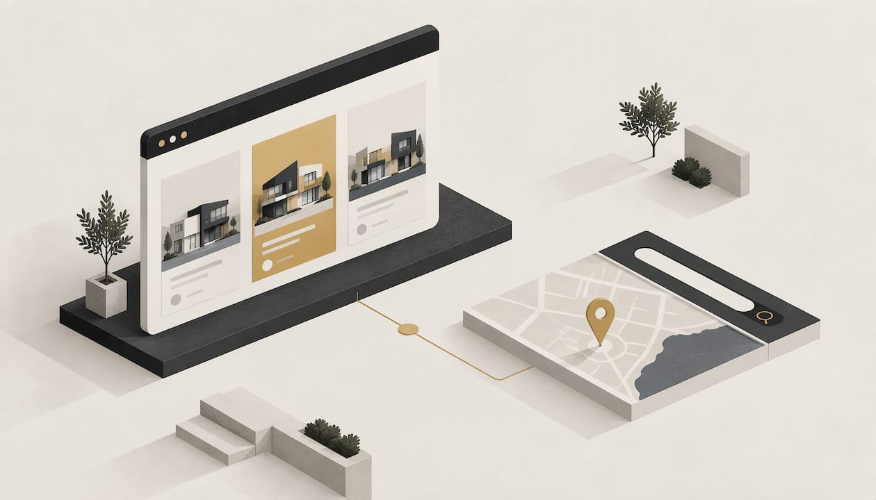
A good real estate website does two jobs. It shows properties clearly enough that buyers and renters find the right one fast, and it gives owners a reason to book an appraisal with you instead of the agency down the road. Everything else, including colours, sliders and clever animation, is secondary to those two jobs. This guide covers the pages, features and design decisions that matter for an Australian agent or property business, and what it takes to get a custom site built.
TL;DR
- Design around three visitors: buyers or renters searching listings, owners wanting an appraisal, and people judging whether they trust you.
- Make search and filtering obvious, show clean professional photos, and keep listing cards short enough to compare at a glance.
- Put an appraisal call to action above the fold, keep the first form to three to five fields, and link to it from suburb pages and the main menu.
- Design for thumbs first: big tap targets, readable type, good contrast and minimal pop-ups.
- A hand-built site from Webline Studio starts at $199 one-off, with care plans from $9 per month.
Table of Contents
- Who your website is really for
- The pages an Australian agency site should have
- Listings, photos and search that help people compare
- Mobile: design for thumbs first
- Design that generates appraisal and listing enquiries
- Accessibility and readability
- Connecting listings and your other tools
- Speed, security and ongoing care
- Template or custom: which suits an agency
- What a custom property site costs with Webline Studio
- Ready for a site built around your agency?
- A short checklist before you brief a designer
- FAQ
- Sources
Who your website is really for
Most agency sites are built as if one person visits. In practice three groups arrive with different intent, and the homepage has to route all of them within a few seconds.
Buyers and renters want to search. They care about suburb, price, bedrooms and whether the photos look like the real place. Owners want to know if you can sell their home and what it might be worth. They are comparing your results, your team and your local knowledge. Everyone else, including neighbours, investors and referrers, is checking that you look like a real, established local business.
A useful test: open your homepage on a phone and give yourself five seconds. Can you start a property search, and can you find how to book an appraisal? If either takes a scroll and a guess, the design needs work.

The pages an Australian agency site should have
There is no single required list, but these pages cover what buyers, renters and owners look for and give search engines something to rank.
| Page | What it does | What to put on it |
|---|---|---|
| Homepage | Routes each visitor | Property search, appraisal call to action, a few featured listings, a clear sign of who you are |
| For sale and for rent | Browsing and comparison | Filters, sorting, result count, consistent listing cards |
| Individual listing | Turns browsing into an enquiry | Gallery, key facts, map, inspection times, enquiry form, agent contact |
| Sold results | Proof of performance | Recent sales with suburb, so owners see you operate in their area |
| Appraisal page | Wins listings | Short form, what happens next, who will respond |
| Suburb pages | Local relevance | A short local overview, your recent activity there, a link to appraisal |
| Team and about | Trust | Real photos, names, roles, the areas you cover |
| Contact | Fallback | Phone, address, opening hours, map |
| Property management | Landlords and tenants | Services for owners, how to apply or enquire for rentals |
If you cover several suburbs, a page per suburb is worth the effort. It gives an owner in that suburb a page that feels written for them, and it gives you a natural place to put the appraisal button.
Listings, photos and search that help people compare
Buyers rarely look at one property. They compare. Google's real estate UX playbook sets out a clear set of practices for this: make search visible, support autosuggestions, sort and filter listings, show concise information, professional imagery and meaningful geographic information. In practice, that translates into a few design rules.
Make search the first thing on the page
Put the search box where the eye lands, not in a submenu. Start with the fields people actually use: suburb, buy or rent, price range, bedrooms and property type. Keep advanced options such as bathrooms, parking or land size behind a "more filters" control so the first view stays simple.
Keep listing cards short and consistent
Each card needs one strong photo, the address or suburb, price or price guide, bedrooms, bathrooms and parking, and a status such as "Under offer" or "Open Saturday". Anything extra slows comparison. Cards should be the same size and layout so the eye can scan down a column.
Show the total number of results and let people sort
A visible result count tells the visitor whether their filters are too tight. Sorting by newest, price low to high and price high to low should always be available. If a search returns nothing, offer nearby suburbs or a way to save the search rather than a blank page.
Treat photography as the product
Photos sell the enquiry. The same playbook lists professional imagery among its core recommendations. Use the largest, sharpest images you have, keep the first photo as the strongest exterior or living shot, and compress files so galleries still load quickly on mobile data. A poor photo or a slow gallery will lose a buyer faster than a plain colour scheme.
Add a map that earns its place
A map is useful when it shows meaningful context: where the property sits relative to the suburb, and what is nearby. Keep it on the listing page and as an optional view on search results, not as a heavy default that slows the page.
Mobile: design for thumbs first
A large share of property browsing happens on phones, often on the couch or between inspections. REA Group's guidance for 3D tours is written for the portal, but its principles apply to any property site: it treats mobile interaction and accessibility as constraints from the start, calling for finger-sized controls, minimal overlays and readable, semantic content.
Translate that into your own build:
- Buttons and filters large enough to tap without zooming. The same REA document specifies a minimum 44-point finger target.
- A menu that collapses cleanly, with search and appraisal reachable in one tap.
- No full-screen pop-ups that cover the listing or are hard to close on a small screen.
- Phone numbers that call when tapped, and addresses that open in maps.
- Gallery swiping that feels natural, with thumbnails that do not crowd the screen.
We go deeper on this in why mobile-friendly design matters more than ever.
Design that generates appraisal and listing enquiries
For most agencies, the most valuable enquiry is an owner asking what their home is worth. Australian marketing guidance from 3P Digital recommends dedicated appraisal landing pages, short initial forms of three to five fields, an appraisal call to action above the fold, and prominent appraisal access on suburb pages and in navigation. The thinking is sound: get the first contact, then qualify during the follow-up call rather than loading the form with questions.
A simple appraisal form
Ask for name, mobile, email and property address. That is four fields. If you want more detail, such as bedrooms or timing, collect it when you call. Under the button, say what happens next: who will contact the owner and roughly when.
Calls to action on every key page
- Homepage: a button in the first screen, not buried beneath the listings.
- Suburb pages: a line such as "Thinking of selling in this suburb?" with the button beside it.
- Navigation: a standing "Free appraisal" or "What's my home worth?" item in the menu.
- Sold results: a prompt next to each recent sale.
Forms for every kind of visitor
Buyers need a quick enquiry or inspection booking on each listing. Renters need an enquiry that makes clear what you need from them. Landlords need a path to talk about property management. Give each a separate, short form so nobody has to sort themselves through a generic contact page.
Build trust where people decide
Put the agent's face and name beside the enquiry form on listings. Show recent sold results, local suburb knowledge and real team photos. Generic stock photos of smiling couples do the opposite of what you want.
Accessibility and readability
Accessibility is good design and good business. REA Group's guidance calls for accessibility-conscious colour contrast, type size, semantic text and alternate text, and recommends limiting interface clutter. For your site that means:
- Body text large enough to read without zooming, on a background with strong contrast.
- Descriptive alt text on listing photos, for example "Open-plan kitchen and living area" rather than "IMG_2031".
- Headings in a logical order, so screen readers and search engines can follow the page.
- Form fields with visible labels, not just placeholder text that disappears.
- Buttons that say what they do.
Connecting listings and your other tools
The practical question for most agencies is how listings get onto the site. Typically they come from the system your office already uses to manage and publish properties, so you do not re-enter every listing by hand. Enquiries from the site also need to land where your team will see them quickly, whether that is a shared inbox or your customer tracking tool.
Before any build starts, write down three things: where your listing data lives today, who needs to receive each type of enquiry, and whether you want featured listings on the homepage or a full searchable database. Those answers decide the scope, and they are easier to settle at the start than after launch.

Speed, security and ongoing care
A property site is image-heavy, so speed needs deliberate attention: properly sized photos, sensible gallery loading and lean pages. Security matters because the site collects names, phone numbers and addresses through enquiry forms. Keep software updated, keep hosting reliable, and fix errors quickly. A listing page that shows an error on a Saturday morning is a lost inspection.
This is where ongoing care plans earn their keep. Hosting, monitoring, content updates and security updates are not exciting, but they are what keeps the site working between redesigns. If you want to see the signs that a site is already hurting you, read 5 signs your website is costing you customers.
Template or custom: which suits an agency
Many agents start with a template because it is quick. The trouble is that every agency in the suburb can end up looking the same, and the layout is built around the template rather than around how your office wins work. A custom site lets you decide where the appraisal button goes, how your sold results are shown and how your suburbs are organised. We compare the two approaches in hand-built vs template websites.
Our view
We build every site from scratch, by hand, for the business in front of us. For an agency, that means we start from the question that matters: how do you win your next listing? From there the design follows. Search that is obvious on a phone, listing cards that are easy to compare, an appraisal button where an owner will actually see it, and a team page that shows real people.
Our small in-house team designs the layout, writes the copy, sets up the basics of SEO and builds the site to be mobile-friendly, fast and secure. We aim to deliver in five business days, and we back the work with a satisfaction guarantee and no lock-in contracts. If your site needs ongoing care, we offer monthly plans that cover hosting, monitoring, updates and fixes, so you are not left on your own after launch.
The point of a website is not to look impressive in a portfolio. It is to make the phone ring and the enquiry form fill. We design for that.
Tyler
What a custom property site costs with Webline Studio
Our published prices are simple. Each build is a one-off fee, and ongoing care is a separate monthly plan.
| Option | Price |
|---|---|
| Base Build | $199 one-off |
| Upgraded Build | $399 one-off |
| Premium Build | $449 one-off |
| Custom Logo | $300 one-off |
| Base Care | $9 per month |
| Upgraded Care | $24 per month |
| Premium Care | $29 per month |
Full details of what each tier includes are on our pricing page. If you want to see how a build runs from brief to launch, what to expect during your 5-day website build walks through it, and our portfolio shows finished sites for local businesses.
Ready for a site built around your agency?
If your current site is slow, dated or hard to use on a phone, we can build you a hand-crafted replacement that reflects your brand and focuses on enquiries. Tell us about your agency, the suburbs you cover and what you want visitors to do, and we will take it from there.

Get started with your website or see how we work first.
A short checklist before you brief a designer
- List your top three suburbs and what makes your agency strong in each.
- Gather your best photography, team photos and recent sold results.
- Decide your main goal: more appraisals, more listing enquiries or more rental applications.
- Know where your listing data comes from today.
- Write down who should receive each type of enquiry.
- Choose a care plan so hosting and updates are looked after from day one.
Sites for other local trades follow the same logic of building around the visitor's next step. If you are curious, we have written similar guides on tradie website design, law firm website design and dental website design.
FAQ
What is the most important feature on a real estate website?
Search that is easy to find and easy to use, followed closely by a clear appraisal call to action. Buyers and renters need to find a property fast, and owners need an obvious way to ask what their home is worth. Everything else supports those two actions.
How many fields should an appraisal form have?
Australian marketing guidance recommends three to five fields for the first form. Name, mobile, email and property address is a practical set. You can collect the rest during the follow-up call.
Should I have a page for each suburb?
If you actively work several suburbs, yes. A suburb page gives owners in that area a page that speaks to them, and it is a natural place for an appraisal button and recent sold results. Keep each page genuinely local rather than copying the same text with the suburb name swapped.
How much does a custom real estate website cost with Webline Studio?
Our builds are $199 for Base, $399 for Upgraded and $449 for Premium, each a one-off fee. Ongoing care plans are $9, $24 and $29 per month. The pricing page lists what each includes.
Sources
- Collection of best practices to delight your users (Google Real Estate UX Playbook)
- 3D tour integration guidelines (REA Group)
- Real Estate Digital Marketing in Australia (3P Digital)