
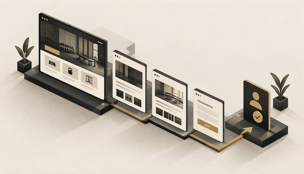
A good gym website does one job: it turns someone searching "gym near me" on their phone into a person standing at your front desk for a trial. That takes a clear offer on the homepage, a visible timetable, honest pricing, one obvious next step, fast mobile pages and a privacy policy that matches how you collect member details. This guide walks through each piece in the order you would plan it.
TL;DR
- Lead with one primary action, such as booking a trial or enquiring about membership, and repeat it the same way across the homepage.
- Build for phones first. Most people check a gym from their phone, and slow pages lose them.
- Include the pages members look for: classes, timetable, pricing, trainers, location, FAQs and contact.
- Plan for accessibility (WCAG 2.2 AA) and a clear privacy policy, because gyms collect health-related information.
- A custom, hand-built site with ongoing care can cost far less than most owners expect. Ours starts at $199 one-off.
Table of Contents
- What a gym website actually has to do
- Plan the site before you pick a layout
- The pages every gym website needs
- Make timetables, bookings and enquiries effortless
- Design for phones first
- Accessibility is part of good gym design
- Privacy: what a gym should plan for
- Findability: let local members find you
- Why a custom site beats a template for a gym
- A simple gym website checklist
- What it costs with Webline Studio
- Ready for a gym site that books members in?
- FAQ
- Sources
What a gym website actually has to do
Most gym owners start by asking what the site should look like. Start with what it should do. Someone arrives with a question: where are you, what does it cost, what classes run on Tuesday night, and will I feel out of place? If the page answers those in the first screen or two, the design is working.
That means your site has three jobs:
- Prove you are the right gym for them. Photos of your actual space, your actual coaches and your actual members beat stock images every time.
- Remove questions. Pricing, timetable, parking, what to bring and what a first visit involves.
- Make the next step easy. One clear action, close to where the reader makes up their mind.
Everything else, from the colour palette to the hero video, supports those three jobs.
Plan the site before you pick a layout
A few decisions made on paper save weeks later.
Decide who the site is for
A boutique reformer Pilates studio, a CrossFit-style box, a 24/7 access gym and a martial arts club all attract different people. Write one sentence for your main member: for example, "busy parents within 10 minutes of the studio who want small-group classes before work." Every headline and photo should speak to that person.
Choose your single main goal
Pick one outcome: trial class bookings, membership enquiries or free pass sign-ups. You can offer others, but one should dominate. Analysis of 98 gym sites by a gym software company, reported in its 2026 write-up, found the strongest performers repeated one primary call to action consistently, and that focus mattered more than feature count. That matches what we see on small business sites generally: fewer choices, more action.
Gather your content first
Before design begins, collect:
- Class descriptions and who each class suits
- Your timetable and any seasonal changes
- Membership options and prices, in the exact wording you want to use
- Photos and short bios of coaches
- Your address, opening hours, parking and public transport notes
- Your privacy policy and terms
Delays in a website project almost always come from missing content, not from design.
The pages every gym website needs
You do not need thirty pages. You need the right ten or so, each with a clear purpose.
| Page | What it must answer | Main action |
|---|---|---|
| Homepage | Who you are, who you help, where you are | Book a trial or enquire |
| Classes or programs | What each session involves and who it suits | View timetable |
| Timetable | What runs, when, and with whom | Book a class |
| Membership and pricing | What it costs and what is included | Join or enquire |
| Trainers or team | Who will coach me | Meet them, book an intro |
| Facilities | What the space is like | Visit |
| Location and contact | How to find you, hours, phone | Call or get directions |
| Success stories or reviews | Will this work for someone like me | Start your trial |
| FAQs | First-visit worries, cancellations, age rules | Contact us |
| Privacy policy | How you handle member information | Read |
The homepage
The first screen should state what you offer and where, with one button. "Small-group strength classes in Parramatta. Book your free trial" beats "Welcome to our gym." Under it, show a short proof section (member photos, a review, your coach credentials) and a preview of your timetable and pricing. People scroll for reassurance, so give it in a sensible order.

Pricing
Hiding prices makes people leave to find a gym that shows them. If your pricing is complex, show a starting point and explain what changes it. Spell out contract length, joining fees and cancellation terms in plain words, because those are the questions members ask last and worry about most.
Trainers
Members join people as much as they join equipment. A photo, a two-line bio, qualifications and one thing each coach is good at helps a nervous beginner picture their first session.

Make timetables, bookings and enquiries effortless
This is where many gym sites lose people. A few principles:
- Show the timetable as text, not an image. An image of a timetable cannot be searched, resized on a phone or read by a screen reader.
- Filter by day and class type so a reader finds Thursday 6 am quickly.
- Put the booking action next to the class. Do not send people to a contact page to ask whether there is a spot.
- Name the button for what happens next. Australian fitness marketers advise using wording like "Book a trial class" or "View class timetable" instead of vague buttons such as "Submit" or "Learn more", as this guide on turning fitness website traffic into bookings explains.
- Keep enquiry forms short. Name, mobile, email and one optional question are usually enough. Every extra field costs you enquiries.
- Confirm what happens after. Tell people they will hear back within a set time, and then do it.
If you use a third-party booking or membership tool, make sure it opens cleanly on a phone and looks like part of your brand. Test the whole journey yourself on a mid-range phone with ordinary mobile data.
Design for phones first
People look up a gym while on the train, on the couch or outside a shopping centre. They want your hours, your location and your timetable within seconds. One major gym software provider's 2026 guide to gym websites says more than 70% of gym website traffic comes from mobile devices and that visitors leave if a site takes longer than three seconds to load. Treat those as the company's figures, but the direction is consistent with how people browse.
Practical mobile rules:
- Put a tap-to-call button and a directions link in the header or a sticky bar.
- Use large, well-spaced buttons that a thumb can hit.
- Compress photos and avoid autoplay background video that delays the first screen.
- Keep body text readable without zooming.
- Collapse long content (class lists, FAQs) into short, scannable blocks.
We go deeper on this in why mobile-friendly design matters more than ever.
Accessibility is part of good gym design
Fitness is for everyone, including members with low vision, limited mobility or hearing loss. Accessibility is also a legal matter. According to a guide on WCAG legal requirements in Australia, section 24 of the Disability Discrimination Act 1992 makes it unlawful for providers of goods and services to discriminate on the ground of disability, and websites count as services. The same guide explains that the Australian Human Rights Commission's April 2025 guidelines point to WCAG 2.2 Level AA as the benchmark. The guidelines are not legally binding, but the Commission can consider them when handling complaints.
What that means for a gym site in practice:
- Colour contrast. Text must stand out clearly from its background. White text on a pale photo fails.
- Keyboard use. Menus, forms and booking buttons should work without a mouse, with a visible focus outline.
- Image descriptions. Add meaningful alt text to photos of facilities and coaches.
- Clear headings and labels. They help screen reader users move around quickly.
- Forms that explain errors. Say what went wrong and how to fix it.
- Captions on any video.
A university accessibility policy in Queensland suggests a simple self-check: use the site with only a keyboard, with a screen reader, with a screen magnifier and with high contrast mode on. You can read its web accessibility policy for the approach. If you are unsure whether your site meets the standard, ask a qualified accessibility specialist to review it.
Privacy: what a gym should plan for
Gyms hold more sensitive information than most small businesses: injury history, weight, heart rate, medical conditions, sometimes payment details. That shapes how your website's forms and policies should work.
According to an Australian gym insurance broker's article on health service providers, details such as injury history, body fat percentage, fitness test results, medication and trainer-recorded fitness goals count as health information under the Privacy Act, which calls for a higher standard of care than ordinary personal data. The same source reports that the small business exemption is being removed. Rules and timing can change, so confirm your obligations with the Office of the Australian Information Commissioner or a privacy lawyer.
For your website, that translates into a few design decisions:
- Publish a privacy policy and link it in the footer and next to every form.
- Collect only what you need at the enquiry stage. Save health questionnaires for a secure process after sign-up, not a public contact form.
- Explain whether data is stored overseas, which can happen with some booking and email tools.
- Tell people how to access or correct their information and how to complain.
A law firm's guide to gym privacy notices and consent forms lists what a notice should cover: what is collected (including online forms and CCTV), why, whether it is optional, who it is shared with, overseas storage, access and correction, complaints, and how marketing opt-outs work. Have your own policy checked by a legal professional before you publish it.
Findability: let local members find you
A beautiful site that nobody finds does nothing. For a gym, local search matters most:
- Use your suburb and service in page titles and headings, for example "Boxing classes in Newtown", written naturally.
- Keep your business name, address and phone number identical on your site and your Google Business Profile.
- Give each major class or program its own page so it can match specific searches.
- Add real photos with descriptive file names and alt text.
- Make the site fast and secure, since both affect how people experience it.
Our website optimisation guide covers what ongoing optimisation involves.
Why a custom site beats a template for a gym
Templates are built to suit every business, which means they suit none of them particularly well. A gym has specific needs: timetable layout, trial offers, coach profiles, membership tiers. Forcing those into a generic layout often leaves you with clumsy workarounds. The hidden costs of do-it-yourself builders also add up, as we explain in the real cost of "free" website builders.
If your current site is slow, outdated or hard to use on a phone, it may already be sending prospects elsewhere. Our list of five signs your website is costing you customers is a quick check.
Our view: build the site around the member's first visit
We build every site by hand, from scratch, with our small in-house team. We do not start from a template, because a gym is not a generic business. Your culture, your coaches and your way of training are what members are buying, and your site should look and sound like you.
Our advice to gym owners is to design for the nervous first-timer. If a person who has never set foot in a gym can see what your classes are like, what they will pay and how to book in under a minute, the experienced members will find it easy too. We write the copy with that person in mind, set up the SEO basics so local searchers can find you, and build for phones from the start.
We also think a website should not be a one-off headache. That is why we offer a satisfaction guarantee, no lock-in contracts and monthly care plans that cover hosting, monitoring, updates and fixes, so you can focus on coaching rather than on what is broken.
Tyler
A simple gym website checklist
Use this before you brief a designer or approve a draft.
Content
- One clear sentence on the homepage saying what you offer and where
- Prices visible without a phone call
- Real photos of your space and people
- Coach bios with qualifications
Conversion
- One primary call to action, worded as the next step
- Booking or enquiry reachable in two taps from any page
- Short forms with a clear confirmation message
Technical
- Loads quickly on mobile data
- Tap-to-call and directions on phones
- Text timetable, not an image
- Secure connection and reliable hosting (see our guide to website hosting for small businesses in Australia)
Compliance
- WCAG 2.2 AA as the accessibility target
- Privacy policy linked in the footer and near forms
- Health information kept out of public forms
What it costs with Webline Studio
We publish our prices, because we think you should not have to ask. Our builds are one-off fees:
- Base Build: $199 one-off
- Upgraded Build: $399 one-off
- Premium Build: $449 one-off
- Custom Logo: $300 one-off
Ongoing care is optional and monthly: Base Care is $9 per month, Upgraded Care is $24 per month and Premium Care is $29 per month. Care plans cover hosting, performance monitoring, content updates, error fixes and security updates. You can compare what each includes on our pricing page.
Ready for a gym site that books members in?
We build a custom, mobile-friendly site for your gym in five business days, including copywriting and SEO setup, with no lock-in contracts and a satisfaction guarantee. If you want to know how the process runs, read what to expect during your 5-day build or see how we work.

When you are ready, get started with your gym website and tell us about your classes, your members and your goals. If you are a different type of local business, our guides to tradie websites and dental practice websites show the same thinking applied to other trades.
FAQ
How many pages does a gym website need?
Most gyms do well with eight to twelve pages: homepage, classes, timetable, pricing, trainers, facilities, location and contact, reviews, FAQs and a privacy policy. Add a page only when it answers a real member question. A small, clear site usually converts better than a large, cluttered one.
What should the main button on a gym homepage say?
Name the action and what follows, such as "Book a free trial class" or "View the timetable". Avoid vague labels like "Submit" or "Learn more". Use the same wording each time it appears so visitors learn what to do.
Does my gym website have to be accessible?
Under the Disability Discrimination Act 1992, providers of services must not discriminate on the ground of disability, and websites count as services. The Australian Human Rights Commission's 2025 guidelines point to WCAG 2.2 Level AA as the benchmark. For advice on your specific site, speak to an accessibility specialist.
Can I collect health details through my website forms?
Keep public enquiry forms to basics such as name, contact details and a short message. Health information is treated with a higher standard of care under the Privacy Act, so handle it through a secure process after sign-up, and have a privacy lawyer review your policy and forms.
Sources
- How fitness businesses can turn website traffic into bookings
- How to create the best gym website
- Is WCAG legally required in Australia?
- Web accessibility policy, University of Queensland
- Is your gym a health service provider?
- Privacy notices and consent forms for gyms